
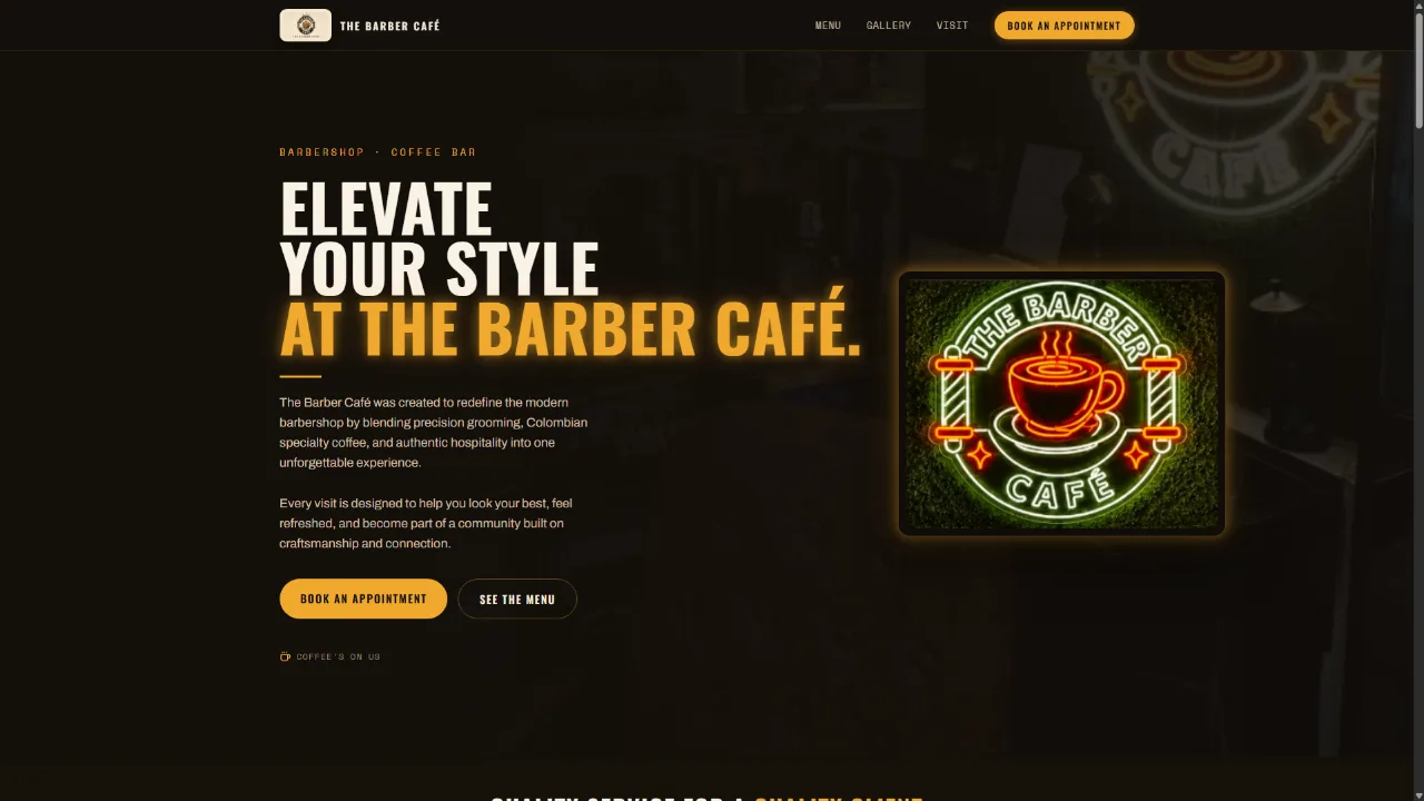
The business
Two businesses share one room: a barbershop and a coffee bar. A customer arriving on the site is trying to answer one of three questions — are you open, what does it cost, and can I book right now.
Almost all of that traffic arrives on a phone, most of it from a Google search or an Instagram profile link. The site's job is not to explain the brand at length. It is to answer those three questions in the first few seconds and put booking within a tap of wherever the visitor happens to be on the page.
The second job is quieter but matters just as much: the café side needs to read as a real part of the business, not an afterthought bolted onto a barbershop page.
What was wrong
The problem wasn't a bad website. There wasn't one.
A customer looking for a barbershop asks three things before they go anywhere: are you open, what does it cost, and can I book. Before the build, none of those had an address. The answers lived on a Facebook page, in an Instagram bio, or nowhere at all — and the reliable way to get one was to call during business hours, which is exactly when the shop is busiest and the customer is least likely to try.
Social accounts kept the shop visible, but they can't hold hours, prices or a booking link where someone can find them in ten seconds. That's the gap the site had to close.
What we did, and why
Four decisions carried the build. Each one came from how customers actually arrive at this business, not from a template.
Answer the three questions above the fold
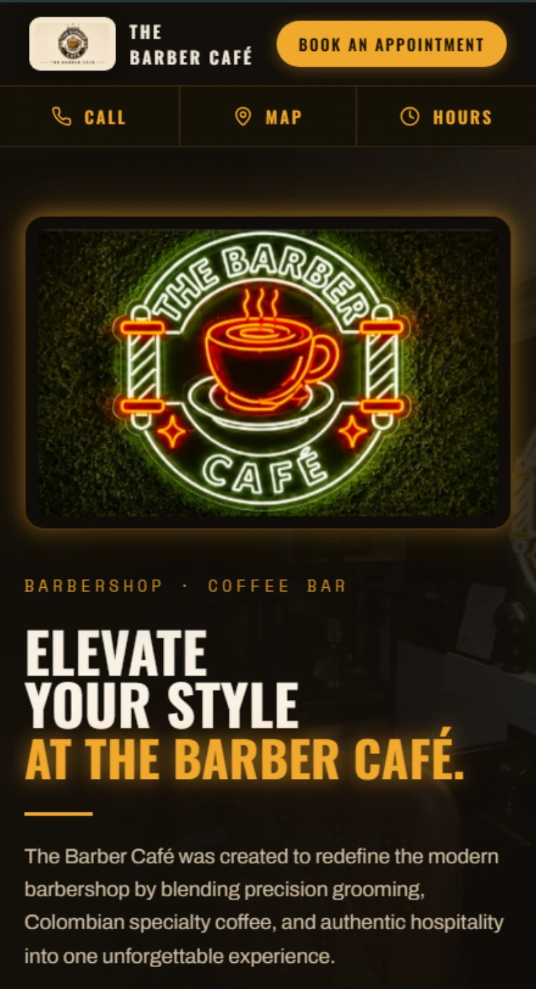
Open or closed, what it costs, and how to book — visible on a phone without scrolling. Everything else on the page comes after those.
Booking never more than a tap away
The booking action repeats down the page and stays reachable on mobile, so a decision made halfway through reading doesn't require a scroll back to the top.
Two businesses, one page, no confusion
The shop and the café each get their own clearly bounded section with their own menu, rather than being merged into one list a customer has to untangle.
Built lean, hand-coded
No page builder and no plugin stack. The page ships close to the minimum it needs, which is most of why it opens quickly on a phone on cellular data.
Designed on a phone first, then scaled up.
The layout was resolved at 390px before anything was decided for desktop, and tested from 320px to 4K before launch.
Where it stands
Live at thebarbercafe.com since July. Indexed in Google search and maintained under an ongoing care plan; every change since launch has gone through the studio.

“CG is professional and the best decision I could have made with our business. Partnering with them has helped take us here at the barber cafe to the next level! You won't regret using CG and all his services for your brand!”